Infographic?
Infographics are invaluable
storytelling tools and a great way to share all of the wonderful things you
provide to your community. They turn data into attractive visual
representations that are easy for people to understand.
Why should you use infographics?
Infographics
are great for making complex information easy to digest. They can be helpful
anytime you want to:
·
Provide a quick overview of a topic
·
Explain a complex process
·
Display research findings or survey data
·
Summarize a long blog post or report
·
Compare and contrast multiple
options
·
Raise awareness about an issue or cause
Here are some tips to make an interesting infographic :
1. Create an outline
An outline can help you to lay out the pieces
of the infographic. Decide which points are essential for getting your message
across.
2. Have a clear title
Start by adding a title that clearly defines
what your infographic is about. There should be no mystery about what the
story is that you are telling. Use a short, catchy title that is easy to
understand and gets your target audience’s attention.
3. Choose the right fonts
Limit yourself to two fonts for the
infographic – one for the title and header and one for the body of the
infographic. You can use a more fun or decorative font for your title and
header but keep your body font simple, so it’s easy to read and not
overwhelming when skimmed at a glance.
4. Choose the right colors
To keep your infographic easy to read and
visually appealing, stick with no more than three to four colors that work well
together. You can use your library’s branding colors, or you can create a new
color palette.
5. Keep it clean and simple
Your goal is to communicate a lot of data in a
simple, easy-to-understand way. Your infographic should not be so busy that it’s
overwhelming or confusing to the reader.
6. Graphics, graphics, graphics
When choosing
graphics, make sure that they look like they belong together. They should have
the same style and colors, if possible. This will provide a more attractive and
cohesive overall look.
7. An easy-to-follow layout
Organize your infographic in a way that flows and tells a visual story. There’s a natural hierarchy in how people in Western cultures view images and text. The most crucial information is more prominent, at the top, and typically read or viewed from left to right.
8. Use your branding
Add your library’s branding to the infographic
so readers know that you created it.
9. Don't forget to promote
After creating your infographic, share it with
as many people as possible. Upload it to your website, share it on social
media, email it to your subscribers, and even blog about it.
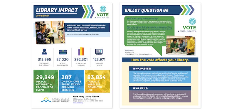
10. Infographics as advocacy tools
Infographics are fantastic ways to tell the
story of your library and all of the activity and value it provides for your
community. They serve as a succinct yet powerful tool to show all that you do,
whether you are sharing with your board, foundation, or voters.
Here is an example of an infographic created
by Eagle Valley Library District for their 2019 measure:
https://www.ebsco.com/sites/default/files/acquiadam-assets/eagle-valley-infographic-image-780.jpg
https://www.ebsco.com/sites/default/files/acquiadam-assets/eagle-valley-infographic-image-780.jpg


Personally, I think making a good infographic is not (quite) an easy thing to do. Nevertheless, thank you for giving insights and tips on how to make a good infographic!
BalasHapus